THE DUFFER BROTHERS
Scope
Art Direction • Educational Content Design • Motion Graphics
Client
MasterClass
Year
[2022]
Industry
Education & Learning • Media & Publishing
For their MasterClass on developing an original television series, Matt and Ross Duffer guide aspiring writers through the creative process behind building a compelling show—from nurturing an initial idea and defining its genre to outlining, screenwriting, collaboration, and pitching.
As part of the MasterClass art direction group, I helped shape the visual identity of the course across its 62-page class guide and accompanying motion graphics. The project received an honorable mention at the 2024 Society of Publication Designers Awards, where the MasterClass editorial design group was also recognized with a Gold Medal for Best of Genre.

Context
The Duffer Brothers are closely associated with a distinctive storytelling language: nostalgic, cinematic, suspenseful, and grounded in the collision between ordinary life and the extraordinary.
The challenge was to translate that sensibility into an educational experience without simply reproducing the visual identity of Stranger Things. The course needed to feel unmistakably connected to the brothers’ creative world while remaining approachable, structured, and useful for students learning how to develop an original television series.
Approach
Working as part of the MasterClass art direction group, I helped translate the visual language of Stranger Things into an editorial system that felt connected to the series without directly recreating it.
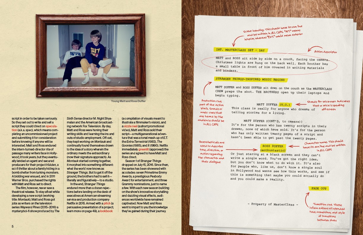
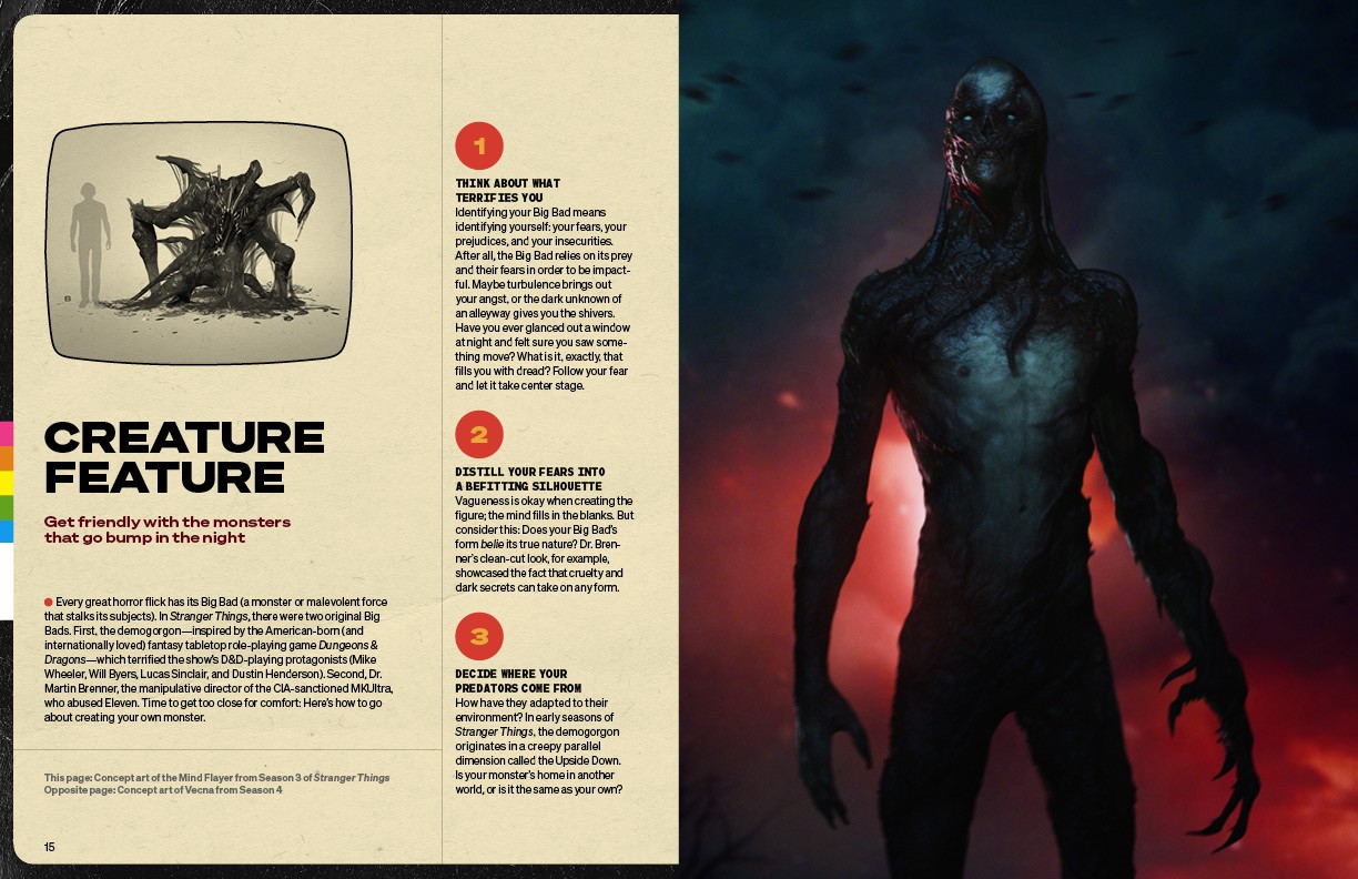
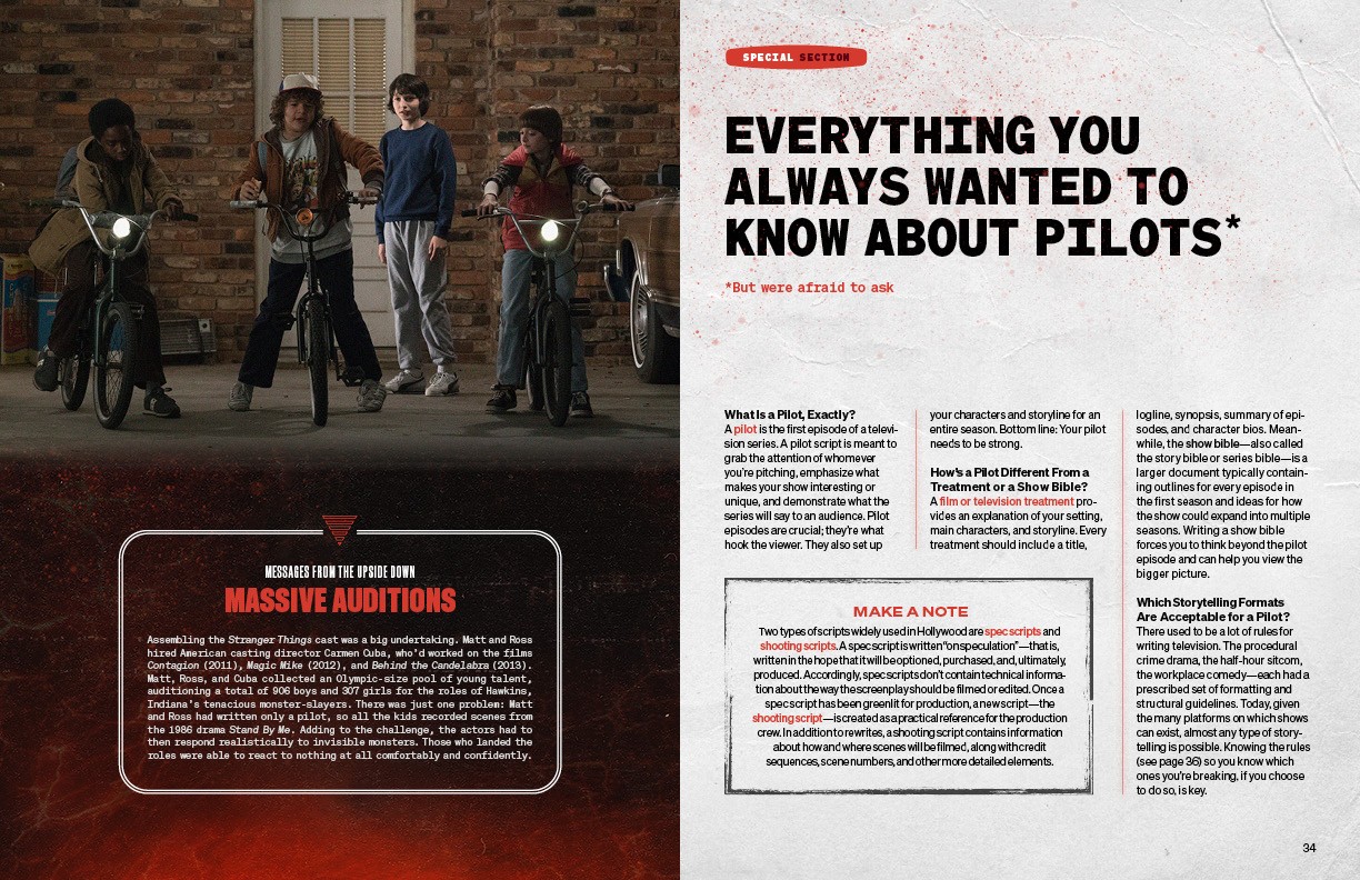
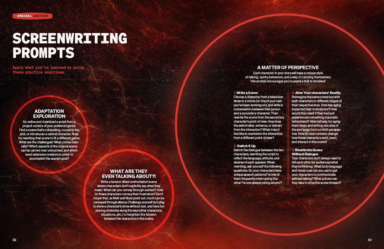
The guide draws cues from the show’s 1980s production design and the lived-in world of Hawkins: warm wood tones, practical Christmas lights and trailing cords, analog televisions, typewritten pages, tabletop materials, and tactile paper textures. These familiar, everyday objects are contrasted with darker spreads inspired by the Upside Down, using deep blacks, saturated red light, atmospheric imagery, and glowing graphic elements to introduce tension and a sense of the supernatural.
Script pages, storyboards, production notes, photographs, annotations, reference imagery, and behind-the-scenes artifacts were layered throughout the guide to give it the feeling of an active writers’ room and working production archive. Expressive typography, period-inspired color, and shifts between warm editorial pages and darker cinematic sections help distinguish lessons, assignments, timelines, and reference material while creating a clear sense of progression through the course.
I also contributed to the art direction of the motion graphics, helping carry the same typography, color, texture, and production-inspired details across the video lessons and supporting guide. This created a cohesive experience in which the filmed environment, on-screen graphics, and editorial materials all felt like parts of the same creative world.
Outcome
The completed system transformed the Duffer Brothers’ creative process into a cohesive experience across editorial design, motion graphics, and the filmed course. Visual cues drawn from Stranger Things gave the project a familiar sense of atmosphere and storytelling, while the structured layouts made complex lessons about writing and television development clear, practical, and approachable.
The class guide works as both an educational resource and an immersive extension of the course. Its balance of nostalgic, tactile details and darker cinematic moments creates a distinctive visual journey without overwhelming the instructional content.
The project received an honorable mention at the 2024 Society of Publication Designers Awards. That same year, the MasterClass editorial design group received a Gold Medal for Best of Genre, recognizing the team’s broader work creating thoughtful, visually distinctive learning experiences across editorial and digital platforms.
Credits
Art Direction, Editorial Design & Motion Graphics
Ralph Hermens
Words
The Duffer Brothers










THE DUFFER BROTHERS
Scope
Art Direction • Educational Content Design • Motion Graphics
Client
MasterClass
Year
[2022]
Industry
Education & Learning • Media & Publishing
For their MasterClass on developing an original television series, Matt and Ross Duffer guide aspiring writers through the creative process behind building a compelling show—from nurturing an initial idea and defining its genre to outlining, screenwriting, collaboration, and pitching.
As part of the MasterClass art direction group, I helped shape the visual identity of the course across its 62-page class guide and accompanying motion graphics. The project received an honorable mention at the 2024 Society of Publication Designers Awards, where the MasterClass editorial design group was also recognized with a Gold Medal for Best of Genre.
Context
The Duffer Brothers are closely associated with a distinctive storytelling language: nostalgic, cinematic, suspenseful, and grounded in the collision between ordinary life and the extraordinary.
The challenge was to translate that sensibility into an educational experience without simply reproducing the visual identity of Stranger Things. The course needed to feel unmistakably connected to the brothers’ creative world while remaining approachable, structured, and useful for students learning how to develop an original television series.
Approach
Working as part of the MasterClass art direction group, I helped translate the visual language of Stranger Things into an editorial system that felt connected to the series without directly recreating it.
The guide draws cues from the show’s 1980s production design and the lived-in world of Hawkins: warm wood tones, practical Christmas lights and trailing cords, analog televisions, typewritten pages, tabletop materials, and tactile paper textures. These familiar, everyday objects are contrasted with darker spreads inspired by the Upside Down, using deep blacks, saturated red light, atmospheric imagery, and glowing graphic elements to introduce tension and a sense of the supernatural.
Script pages, storyboards, production notes, photographs, annotations, reference imagery, and behind-the-scenes artifacts were layered throughout the guide to give it the feeling of an active writers’ room and working production archive. Expressive typography, period-inspired color, and shifts between warm editorial pages and darker cinematic sections help distinguish lessons, assignments, timelines, and reference material while creating a clear sense of progression through the course.
I also contributed to the art direction of the motion graphics, helping carry the same typography, color, texture, and production-inspired details across the video lessons and supporting guide. This created a cohesive experience in which the filmed environment, on-screen graphics, and editorial materials all felt like parts of the same creative world.
Outcome
The completed system transformed the Duffer Brothers’ creative process into a cohesive experience across editorial design, motion graphics, and the filmed course. Visual cues drawn from Stranger Things gave the project a familiar sense of atmosphere and storytelling, while the structured layouts made complex lessons about writing and television development clear, practical, and approachable.
The class guide works as both an educational resource and an immersive extension of the course. Its balance of nostalgic, tactile details and darker cinematic moments creates a distinctive visual journey without overwhelming the instructional content.
The project received an honorable mention at the 2024 Society of Publication Designers Awards. That same year, the MasterClass editorial design group received a Gold Medal for Best of Genre, recognizing the team’s broader work creating thoughtful, visually distinctive learning experiences across editorial and digital platforms.
Credits
Art Direction, Editorial Design & Motion Graphics
Ralph Hermens
Words
The Duffer Brothers
THE DUFFER BROTHERS
Scope
Art Direction • Educational Content Design • Motion Graphics
Client
MasterClass
Year
[2022]
Industry
Education & Learning • Media & Publishing
For their MasterClass on developing an original television series, Matt and Ross Duffer guide aspiring writers through the creative process behind building a compelling show—from nurturing an initial idea and defining its genre to outlining, screenwriting, collaboration, and pitching.
As part of the MasterClass art direction group, I helped shape the visual identity of the course across its 62-page class guide and accompanying motion graphics. The project received an honorable mention at the 2024 Society of Publication Designers Awards, where the MasterClass editorial design group was also recognized with a Gold Medal for Best of Genre.
Context
The Duffer Brothers are closely associated with a distinctive storytelling language: nostalgic, cinematic, suspenseful, and grounded in the collision between ordinary life and the extraordinary.
The challenge was to translate that sensibility into an educational experience without simply reproducing the visual identity of Stranger Things. The course needed to feel unmistakably connected to the brothers’ creative world while remaining approachable, structured, and useful for students learning how to develop an original television series.
Approach
Working as part of the MasterClass art direction group, I helped translate the visual language of Stranger Things into an editorial system that felt connected to the series without directly recreating it.
The guide draws cues from the show’s 1980s production design and the lived-in world of Hawkins: warm wood tones, practical Christmas lights and trailing cords, analog televisions, typewritten pages, tabletop materials, and tactile paper textures. These familiar, everyday objects are contrasted with darker spreads inspired by the Upside Down, using deep blacks, saturated red light, atmospheric imagery, and glowing graphic elements to introduce tension and a sense of the supernatural.
Script pages, storyboards, production notes, photographs, annotations, reference imagery, and behind-the-scenes artifacts were layered throughout the guide to give it the feeling of an active writers’ room and working production archive. Expressive typography, period-inspired color, and shifts between warm editorial pages and darker cinematic sections help distinguish lessons, assignments, timelines, and reference material while creating a clear sense of progression through the course.
I also contributed to the art direction of the motion graphics, helping carry the same typography, color, texture, and production-inspired details across the video lessons and supporting guide. This created a cohesive experience in which the filmed environment, on-screen graphics, and editorial materials all felt like parts of the same creative world.
Outcome
The completed system transformed the Duffer Brothers’ creative process into a cohesive experience across editorial design, motion graphics, and the filmed course. Visual cues drawn from Stranger Things gave the project a familiar sense of atmosphere and storytelling, while the structured layouts made complex lessons about writing and television development clear, practical, and approachable.
The class guide works as both an educational resource and an immersive extension of the course. Its balance of nostalgic, tactile details and darker cinematic moments creates a distinctive visual journey without overwhelming the instructional content.
The project received an honorable mention at the 2024 Society of Publication Designers Awards. That same year, the MasterClass editorial design group received a Gold Medal for Best of Genre, recognizing the team’s broader work creating thoughtful, visually distinctive learning experiences across editorial and digital platforms.
Credits
Art Direction, Editorial Design & Motion Graphics
Ralph Hermens
Words
The Duffer Brothers